In the fast-paced world of web design and development, efficiency and consistency are paramount. Building user interfaces from scratch for every project, or even every new screen, can be a time-consuming and error-prone process. Designers often find themselves recreating common elements, while developers grapple with inconsistencies that lead to a fragmented user experience and increased technical debt.
This is where a foundational design kit becomes an indispensable asset. Far more than just a style guide, a design kit provides a curated collection of reusable UI components and guidelines, empowering teams to accelerate their workflows, maintain visual harmony, and focus on solving complex user problems rather than reinventing basic building blocks. For anyone involved in crafting digital experiences, understanding and leveraging these kits is a significant step towards more streamlined and scalable projects.
What Exactly is a Foundational Design Kit?
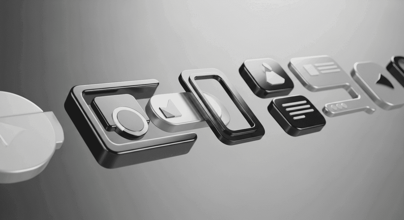
At its core, a foundational design kit is a carefully assembled library of essential user interface elements and the rules governing their application. Think of it as a starter pack for your digital products, containing the most fundamental ingredients needed to construct a cohesive and functional interface. These ingredients include predefined color palettes, typography scales, spacing units, and basic UI components like buttons, input fields, checkboxes, and navigation elements.
While often confused with a complete design system, a foundational design kit typically focuses on the atomic and molecular levels of UI design. It lays the groundwork upon which a more extensive design system might eventually be built. Its primary goal is to establish a consistent visual language and provide readily available, well-documented components that can be quickly assembled, reducing the need for designers and developers to make repetitive decisions or create elements from scratch.
The Core Benefits: Why Bother?
The advantages of adopting a foundational design kit are multifaceted, impacting everything from project timelines to user satisfaction. The most immediate benefit is a dramatic increase in efficiency. With pre-built components and established guidelines, designers can prototype and iterate much faster, while developers can implement UIs with greater speed and fewer discrepancies. This translates directly into reduced development cycles and quicker time-to-market for new features or products.
Beyond speed, a design kit is a powerful tool for ensuring consistency. By standardizing visual and interactive elements, it eliminates the "Frankenstein" effect where different parts of a website or application feel disconnected. This consistency not only strengthens brand identity but also significantly improves the user experience, as users encounter predictable and intuitive interfaces. Furthermore, a shared language and set of tools foster better collaboration between designers, developers, and other stakeholders, ensuring everyone is working from the same playbook.
- Faster prototyping and iteration cycles
- Reduced design and development debt
- Enhanced brand consistency across all touchpoints
- Simplified collaboration between design and development teams
- Improved user experience through predictable interfaces
- Easier onboarding for new team members and external contractors
Key Components of an Effective Kit
A truly effective foundational design kit isn't just a random assortment of assets; it's a thoughtfully organized collection of interconnected elements. The typical components can be categorized as follows:
First, Visual Styles: This includes your project's color palette (primary, secondary, accent, neutral, and semantic colors), typography (font families, sizes, weights, line heights), and spacing conventions (a consistent grid system or spacing scale for margins and padding). These elements are the bedrock of your visual identity, ensuring every piece of UI looks and feels like part of the same family. Second, Basic UI Components: These are the interactive building blocks users engage with daily. Examples include buttons (various states like primary, secondary, disabled), input fields (text, number, date), checkboxes, radio buttons, toggles, dropdowns, and navigation links. Each component should have defined states (e.g., hover, active, disabled) and clear usage guidelines. Additionally, an iconography set, providing a consistent visual language for actions and concepts, is crucial for usability and recognition.
Implementing and Integrating Your Kit
Bringing a foundational design kit into your workflow doesn't have to be an overwhelming task. A practical approach often involves starting small and iterating. Begin by auditing your existing UI to identify commonly used elements and inconsistencies. This will help prioritize which components to standardize first. Document everything clearly – not just how components look, but also how they behave and when to use them.
For designers, tools like Figma, Sketch, and Adobe XD are ideal for creating and managing design kit components. They allow for the creation of reusable symbols, components, and styles that can be easily updated across an entire project. For developers, integrating the kit means translating these design components into code. This often involves creating a component library using front-end frameworks like React, Vue, or Svelte, or simply establishing a robust CSS framework that aligns with the design specifications. The key is to create a seamless handover process where design decisions are accurately reflected in the final coded product.
Maintaining and Evolving Your Kit
A foundational design kit is not a static artifact; it's a living, breathing asset that requires ongoing care and attention. As projects evolve, technologies change, and user feedback comes in, your kit will need updates. Regularly review your components and guidelines to ensure they remain relevant and effective. This might involve adding new components, refining existing ones, or updating visual styles to align with brand shifts or new design trends.
Establishing a clear process for feedback and contributions is vital. Encourage both designers and developers to suggest improvements or identify areas where new components are needed. Version control is also crucial, especially for the coded components, to track changes and ensure everyone is working with the latest versions. By treating your design kit as an integral part of your product development lifecycle, continuously refining and expanding it, you ensure it remains a powerful tool for accelerating UI workflows and delivering exceptional digital experiences.
In conclusion, adopting a foundational design kit is more than just a trend; it's a strategic investment in the efficiency, consistency, and scalability of your web projects. By providing a clear, reusable set of UI components and guidelines, these kits empower teams to build better interfaces faster, fostering collaboration and freeing up valuable time to focus on innovation and user-centric problem-solving.
Whether you're a solo freelancer or part of a larger team, integrating a foundational design kit into your workflow is a practical step towards streamlining your design and development processes, ultimately leading to higher quality products and a more robust digital presence. Start with the basics, iterate, and watch your UI workflows transform.
Sources & Further Reading
- Design Systems 101 — Nielsen Norman Group
- Consistency in UI Design: Why It's Important and How to Achieve It — Interaction Design Foundation
- Web Components — MDN Web Docs