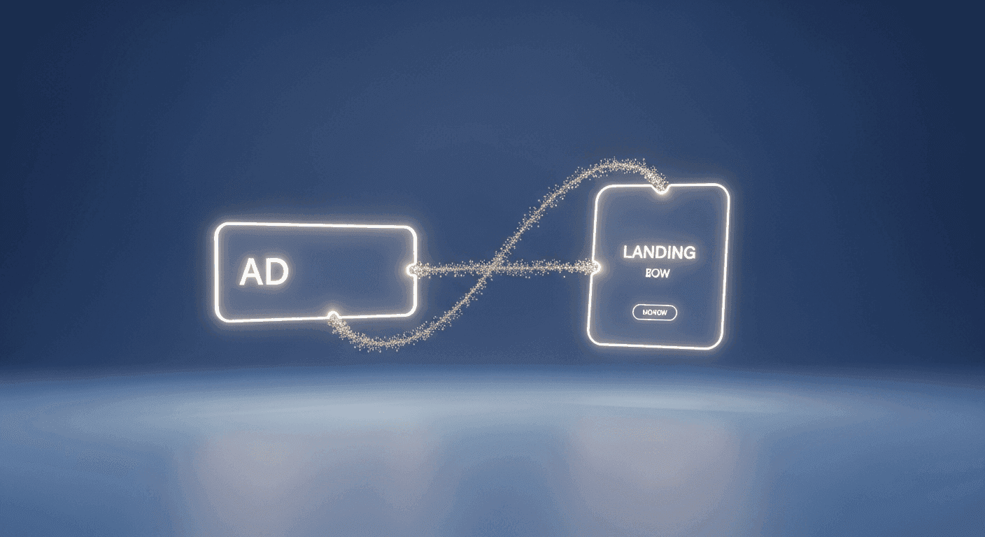
In the world of digital marketing, an effective advertisement is only half the battle. The crucial next step is what happens when a user clicks that ad and arrives on your landing page. This handoff, often overlooked, is where many campaigns falter. The concept of 'message match' is about creating a seamless, coherent experience between your ad and the landing page it directs to, ensuring that the user's expectations are met and their journey towards conversion feels natural and uninterrupted.
For designers, makers, and developers building websites, understanding and implementing strong message match isn't just a marketing tactic – it's a fundamental aspect of good user experience (UX) design. When a user clicks an ad, they've been promised something. Your landing page must immediately confirm that promise, visually and textually, to build trust and guide them efficiently towards the desired action. This article will explore practical strategies for achieving this vital alignment, transforming clicks into meaningful conversions.
The Core Principle: Why Message Match Matters
Imagine clicking an ad for a specific product or service, only to land on a generic homepage or a page that looks completely different and talks about something else entirely. This jarring experience is the antithesis of good message match. Users have short attention spans and high expectations. Any perceived disconnect between the ad's promise and the landing page's content or design can lead to immediate confusion, frustration, and ultimately, a high bounce rate. They feel misled, diminishing trust and wasting your valuable ad spend.
Effective message match ensures continuity, reinforcing the user's initial interest and validating their click. It creates a psychological bridge, making the transition from ad to landing page feel like a natural progression rather than a sudden detour. This not only keeps users engaged longer but also significantly increases the likelihood of them completing the desired action, whether that's making a purchase, signing up for a newsletter, or downloading a resource. It's about respecting the user's time and intention.
Visual Consistency: Bridging the Aesthetic Gap
The first impression a landing page makes is visual, and it should immediately echo the ad that brought the user there. This means maintaining consistency in branding elements like color palettes, typography, and imagery. If your ad features a specific product in a vibrant blue, your landing page should reflect that same blue and showcase the product prominently. Inconsistent visuals can create doubt and signal a lack of professionalism, even if the content is relevant.
Beyond just replicating elements, aim for a consistent mood and aesthetic. If your ad is clean and modern, your landing page shouldn't be cluttered and traditional. The layout, use of white space, and overall design language should feel like a natural extension. This visual harmony reassures the user they're in the right place and prepares them to absorb the page's message without distraction. Think of it as a consistent brand story told across different touchpoints.
Content Harmony: Speaking the Same Language
While visuals draw the eye, it's the copy that truly seals the deal. The headlines, sub-headlines, and body text on your landing page must directly address and expand upon the claims or questions posed in your ad. If your ad promises '50% off all winter coats,' your landing page headline should immediately confirm 'Get 50% Off Your New Winter Coat' or something similar. Any deviation here can lead to confusion and a quick exit.
Maintain consistency in your value proposition and specific terminology. If your ad highlights a unique feature or benefit, ensure that same feature is prominent and explained clearly on the landing page. The tone of voice should also be consistent – whether it's friendly, authoritative, or playful. Users expect a direct follow-through on the ad's promise. The landing page is where you elaborate on that promise, provide evidence, and guide them towards fulfilling it. Use keywords from your ad in your landing page copy to further reinforce the match for both users and search engines.
- Primary headline and sub-headline
- Core value proposition or unique selling point
- The specific Call to Action (CTA) or implied next step
- Key keywords, phrases, and industry terminology
- Prominent imagery or visual theme
- Overall brand tone, voice, and style
Structural & Navigational Flow: Guiding the User
The layout and structure of your landing page play a critical role in guiding the user's journey. A strong message match extends to how information is presented. If your ad focused on a particular problem your product solves, the landing page should immediately present that problem, then your solution, followed by benefits and a clear path to conversion. The information hierarchy should feel intuitive and logical, building upon the context established by the ad.
Effective landing pages are often stripped of unnecessary distractions. This means minimizing external navigation links that could pull users away from the conversion goal. The landing page's purpose is singular: to convert the user who clicked a specific ad. Maintain focus by eliminating elements like extensive menus, social media feeds, or links to unrelated blog posts. Every element on the page should serve to reinforce the ad's message and facilitate the desired action.
Crafting the Call to Action: The Conversion Bridge
The Call to Action (CTA) is the culmination of your message match efforts. It should be a clear, compelling, and direct next step that naturally flows from the ad's promise and the landing page's content. If your ad offered a 'Free Demo,' the landing page's CTA should explicitly state 'Get Your Free Demo' or 'Schedule a Demo Now.' Ambiguous or generic CTAs like 'Learn More' can introduce friction and uncertainty at the most critical point of the user journey.
Ensure your CTA stands out visually and uses action-oriented language. It should be prominently placed, easy to understand, and instill confidence. The micro-copy around the CTA can also reinforce message match by reiterating a key benefit or addressing potential hesitations, directly connecting back to the ad's initial appeal. A well-matched CTA makes the conversion feel like an obvious and desirable conclusion to the user's interaction.
Testing and Iteration: Refining Your Match
Achieving perfect message match is rarely a one-shot deal. It's an ongoing process of testing, learning, and refinement. A/B testing different headlines, images, CTA button texts, or even entire layout variations can provide invaluable insights into what resonates most effectively with your target audience. Pay close attention to metrics like bounce rate, time on page, and conversion rates, correlating them back to specific ad campaigns.
User feedback, even informal, can also highlight areas where there might be a disconnect. The digital landscape is constantly evolving, as are user expectations. Regularly reviewing your ad-to-landing page sequences ensures that your message remains cohesive, compelling, and continuously optimized for seamless conversions, making your web design and development efforts truly impactful for marketing goals.
Sources & Further Reading
- User Journey — Interaction Design Foundation
- Landing page — Wikipedia
- Cognitive Load — Interaction Design Foundation