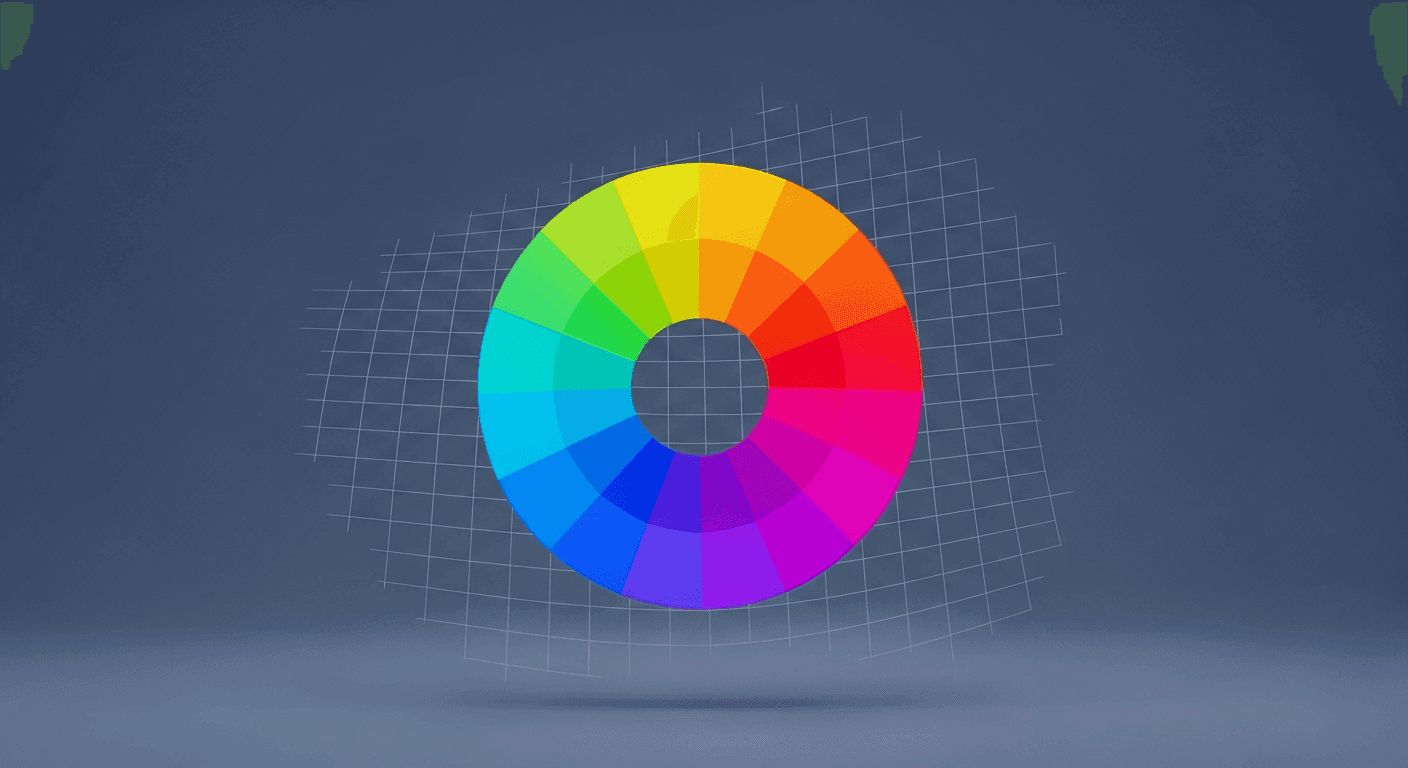
Color on the web is far more than just an aesthetic choice; it's a powerful, non-verbal communicator of a brand's essence. For anyone designing or building websites, understanding how to leverage color effectively can transform a good site into a truly impactful one. A well-crafted color palette doesn't just look appealing; it reinforces identity, evokes specific emotions, and guides user experience, all while reflecting the very soul of the brand it represents.
This strategic approach to color selection moves beyond personal preference or fleeting trends. It's about intentionally translating the core values, personality, and aspirations of a brand into a visual language that resonates with its target audience. By systematically mapping these abstract brand attributes to concrete color choices, designers and developers can create web experiences that are not only beautiful but also deeply meaningful and effective.
Understanding Your Brand's Core Identity
Before even thinking about hex codes or gradients, the foundational step is to thoroughly understand the brand you're working with. This involves delving deep into its mission, vision, values, and target audience. Is the brand innovative or traditional? Playful or serious? Luxurious or accessible? These are the questions that will inform every subsequent color decision.
Engage with stakeholders, review brand guidelines (if they exist), and identify key adjectives that describe the brand's personality and desired perception. These keywords – like 'trustworthy,' 'energetic,' 'calm,' 'sophisticated,' or 'sustainable' – will serve as your compass throughout the color selection process. Without a clear understanding of the brand's identity, any color choices will lack direction and impact.
The Psychology of Color: More Than Just Pretty Hues
Every color carries with it a wealth of cultural associations, emotional responses, and psychological effects. While these can vary slightly by region and context, there are widely recognized principles of color psychology that designers can leverage. Understanding these associations allows you to select colors that naturally align with and amplify the brand's intended message, rather than sending conflicting signals.
A brand aiming for reliability and professionalism, for instance, might lean towards blues, while one emphasizing creativity and vibrancy might explore oranges or purples. It's crucial to consider how these universal responses to color interact with your specific brand values. Here are some common color associations:
- Blue: Trust, stability, calm, professionalism, intelligence
- Green: Nature, growth, health, freshness, tranquility, wealth
- Red: Energy, passion, urgency, excitement, danger
- Yellow: Optimism, happiness, warmth, creativity, caution
- Purple: Luxury, royalty, creativity, wisdom, mystery
- Black: Sophistication, power, elegance, formality
- White: Purity, simplicity, cleanliness, minimalism, fresh starts
Translating Values into a Primary Palette
Once you have a firm grasp of the brand's identity and the psychological impact of colors, it's time to select your primary palette. These are the 1-2 dominant colors that will form the backbone of your web design. They should be the most direct visual representation of the brand's core values.
For example, if a brand values 'innovation' and 'reliability,' you might pair a forward-thinking vibrant blue (for innovation) with a more grounded, perhaps darker, complementary blue or a neutral gray (for reliability). Consider the emotional weight and cultural context of each choice. The primary colors will appear most frequently across the site, so their impact must be immediate and consistent with the brand's core message.
Building a Supportive Secondary and Accent Palette
A strong primary palette is essential, but a complete web design needs a supportive cast of secondary and accent colors to add depth, hierarchy, and visual interest. Secondary colors expand on the primary message, offering variety without diluting the brand's core identity. They might be lighter or darker shades of the primary colors, or harmonious complementary tones that add balance.
Accent colors, on the other hand, are used sparingly to draw attention to crucial elements like calls-to-action, interactive states, or key pieces of information. These often have a higher contrast and can introduce a subtle pop of energy or sophistication. When building these palettes, consider color harmony principles like monochromatic, analogous, complementary, or triadic schemes to ensure a cohesive and visually pleasing outcome. Tools and online generators can assist in exploring these relationships, but always filter choices through the lens of brand values.
Practical Application and Testing
With a strategic color palette defined, the next step is its practical application across the website. Think about how colors will be used for backgrounds, typography, buttons, links, icons, and imagery. Consistency is key; establish guidelines for usage to ensure a unified experience. For instance, a specific accent color might always be reserved for primary call-to-action buttons.
Beyond aesthetics, always prioritize accessibility. Ensure sufficient color contrast between text and backgrounds to meet WCAG standards, making your site usable for everyone, including those with visual impairments. Finally, test your palette. Gather feedback from target users to see if the colors evoke the intended emotions and reinforce the brand values as planned. Be prepared to iterate and refine, ensuring your color choices truly serve the brand's strategic goals.
Mapping brand values to web color palettes is a thoughtful, strategic process that goes beyond simply picking colors you like. It's about crafting a visual language that speaks volumes, reinforces identity, and deeply connects with your audience. By approaching color with intention and a clear understanding of its power, you can design and build websites that are not only aesthetically pleasing but also profoundly effective and resonant.
Sources & Further Reading
- Color theory — Wikipedia
- The Psychology of Color in Web Design and Marketing — Interaction Design Foundation
- Brand identity — Wikipedia
- color — MDN Web Docs