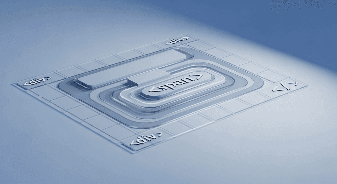
The skeleton of every webpage is its HTML structure. While it might seem straightforward to just add elements to display content, how you organize that HTML has profound implications for how your website looks and behaves. A well-thought-out HTML structure isn't just about displaying information; it's the bedrock for consistent styling with CSS and efficient interactivity with JavaScript.
For designers, makers, and developers alike, a predictable HTML structure is a game-changer. It simplifies debugging, streamlines collaboration, and makes future updates far less daunting. By establishing clear rules and logical hierarchies, you ensure that your visual designs translate accurately and your scripts perform reliably, without battling unexpected layout shifts or broken functionalities.
Embrace Semantic HTML for Clarity
Semantic HTML means using tags that convey meaning about the content they contain, rather than just how they should appear. Instead of relying solely on generic `<div>` elements, leverage tags like `<header>`, `<nav>`, `<main>`, `<article>`, `<section>`, `<aside>`, and `<footer>`. These tags tell browsers, search engines, and assistive technologies what role each part of your document plays.
This semantic richness isn't just for accessibility and SEO; it vastly improves the predictability of your styling. When a developer sees a `<nav>` element, they inherently understand its purpose, making it easier to apply appropriate styles without needing to decipher complex class names. It creates a shared understanding that benefits the entire development process.
Logical Nesting and Document Flow
Proper nesting of HTML elements is crucial. Every element should have a logical parent-child relationship. For instance, a list item `<li>` should always be inside an unordered `<ul>` or ordered `<ol>` list. Incorrect nesting can lead to unexpected layout issues, browser rendering differences, and make your CSS far harder to manage. Understand the natural document flow: block-level elements typically stack vertically, while inline elements flow horizontally.
This fundamental understanding allows you to predict how elements will position themselves by default, before applying any CSS. When you then introduce CSS properties like `display`, `position`, or Flexbox/Grid, you're working with, rather than against, the browser's default rendering behavior, leading to more stable and predictable layouts.
Consistent Class and ID Naming Conventions
Consistency in naming classes and IDs is paramount for long-term maintainability and predictability. Adopt a clear naming convention early in your project, whether it's BEM (Block Element Modifier), SMACSS (Scalable and Modular Architecture for CSS), or a utility-first approach. This ensures that every team member can instantly understand the purpose of a class or ID without needing to consult documentation.
Remember the distinction: classes (`.my-component`) are for reusable styles that can be applied to multiple elements, while IDs (`#unique-section`) should be unique within a page, typically reserved for very specific elements or as JavaScript hooks. Misusing IDs for styling often leads to specificity wars and inflexible CSS.
- Choose descriptive, human-readable names that convey purpose.
- Avoid overly generic or single-letter names that lack context.
- Establish a project-wide naming convention and stick to it.
- Use hyphens (kebab-case) for readability in class names.
- Reserve IDs for unique elements or specific JavaScript hooks.
Leverage Data Attributes for Scripting Hooks
While classes can sometimes serve as JavaScript hooks, using `data-*` attributes is a cleaner and more robust approach. Data attributes allow you to embed custom, private data directly into your HTML elements. For example, `data-action="toggle-menu"` or `data-user-id="123"`.
This practice effectively separates your concerns: classes are for styling, and data attributes are for JavaScript behavior. This separation makes your code much more predictable. If a designer changes a class name for styling purposes, it won't inadvertently break a script that was relying on that class name for its functionality. It creates a clear contract between your HTML, CSS, and JS.
Modularity and Reusability with Components
Think of your UI in terms of modular, reusable components. Instead of a monolithic HTML file, break down your interface into smaller, self-contained units like buttons, cards, navigation items, or forms. Each component should have its own clearly defined HTML structure, which can then be reused across different parts of your website.
This component-based thinking naturally encourages better HTML structure. Each component is designed to function independently, making its styling and scripting predictable regardless of where it's placed. This approach drastically improves scalability, makes updates more manageable, and ensures a consistent user experience across your entire project.
Maintain a Clean and Lean DOM
Finally, strive for a clean and lean Document Object Model (DOM). Avoid unnecessary wrapper `<div>` elements, often referred to as 'divitis.' Every element in your HTML should serve a clear purpose, whether it's semantic, for styling hooks, or for JavaScript interaction. Bloated HTML can make your page slower to render and more difficult to navigate for both humans and machines.
A well-structured, minimalist DOM is easier to read, debug, and maintain. It also provides a more performant foundation for your CSS and JavaScript. By meticulously structuring your HTML, you lay the groundwork for a web project that is not only robust and scalable but also a joy to work on for everyone involved.
Sources & Further Reading
- Introduction to HTML — MDN Web Docs
- Specifics on CSS Specificity — CSS-Tricks
- Web standards — Wikipedia