Crafting responsive and visually appealing web layouts is a cornerstone of modern web development. For years, developers wrestled with floats, positioning, and display properties to achieve even basic arrangements. Fortunately, CSS Flexbox and CSS Grid emerged as game-changers, offering powerful and intuitive ways to control element placement and behavior. These two layout modules have revolutionized how we build interfaces, making complex designs more manageable and maintainable.
However, with two potent tools at your disposal, a common question arises: when should you use Flexbox, and when is Grid the better choice? While they share the goal of simplifying layout, their fundamental approaches and ideal use cases differ significantly. Understanding these distinctions is crucial for efficient development, enabling you to pick the right tool for the job and create robust, adaptable websites. This article will break down each system, highlight their key differences, and provide clear guidance on when to employ Flexbox versus Grid.
Understanding CSS Flexbox
CSS Flexbox, short for the Flexible Box Module, is a one-dimensional layout system. This means it's designed to arrange items along a single axis at a time – either horizontally (as a row) or vertically (as a column). Its primary strength lies in distributing space among items within a container and aligning them, even when the items have varying sizes. Flexbox is incredibly efficient for creating dynamic components where the content's size might dictate the overall layout.
When you apply `display: flex` to a container, its direct children become flex items. You then gain control over their direction (`flex-direction`), how they wrap (`flex-wrap`), how space is distributed along the main axis (`justify-content`), and how they align along the cross axis (`align-items`). Individual flex items can also have properties like `flex-grow`, `flex-shrink`, and `flex-basis` to control how they resize and take up available space, making them highly adaptable to different screen sizes and content lengths.
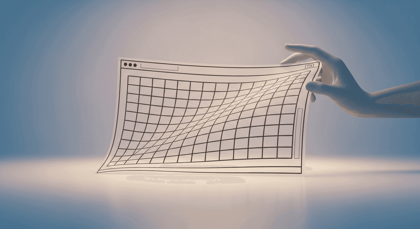
Understanding CSS Grid
In contrast, CSS Grid Layout is a two-dimensional layout system. This means it can handle both rows and columns simultaneously, giving you precise control over element placement across both axes. Grid is ideal for designing the overall structure of a page or complex sections where items need to align in both directions, forming a grid of cells.
When you declare `display: grid` on a container, you define a grid by specifying the number and size of your columns (`grid-template-columns`) and rows (`grid-template-rows`). You can also control the spacing between grid items with `grid-gap` (or `row-gap` and `column-gap`). Grid allows you to place items explicitly into specific grid cells or areas, and even have them span multiple rows and columns. This explicit control makes it perfect for laying out entire pages or intricate components that require a structured, multi-dimensional arrangement.
Key Differences and Similarities
The most fundamental difference is dimensionality: Flexbox is 1D, arranging items in a single line, while Grid is 2D, arranging items in both rows and columns. This dictates their primary use cases. Flexbox is often described as 'content-out,' meaning the content within the items influences how they are laid out. Grid, on the other hand, is 'layout-in,' where you first define the grid structure, and then place items into that predefined structure.
Despite their differences, both systems excel at alignment and distribution. Both offer properties to align items and content along their respective axes. They are also both incredibly powerful for creating responsive designs, adapting layouts to various screen sizes without relying on older, less semantic methods. Importantly, they are not mutually exclusive; they are designed to complement each other.
When to Use Flexbox
Flexbox shines brightest when you need to arrange a group of items along a single line, and you're primarily concerned with how those items distribute space among themselves or align relative to each other. It's perfect for components where the number of items might change, or their individual sizes are dynamic. Think of it for smaller-scale layouts or components within a larger structure.
- Navigation bars: Easily arrange menu items horizontally or vertically, with flexible spacing and alignment.
- Component cards: Create a row of cards where each card's content might vary in height, but you want them to align at the top or bottom.
- Form elements: Align labels with input fields, or arrange a group of buttons.
- Distributing items: Evenly space elements across a container, or push one item to an edge while others cluster.
- Centering: Flexbox makes it incredibly simple to center an item both horizontally and vertically within its parent.
When to Use Grid
Grid is your go-to for macro-layouts, meaning the overall page structure or complex sections that require a defined structure in both rows and columns. It's powerful for creating responsive interfaces where elements might need to flow into different areas based on screen size, or where items need to overlap or span multiple tracks. If you're thinking about a page in terms of distinct regions like a header, sidebar, main content, and footer, Grid is the ideal choice.
Consider Grid for scenarios such as dashboard layouts, image galleries where items have specific row/column spans, or any design where precise placement of elements in two dimensions is critical. Its ability to define explicit tracks and areas makes it much easier to visualize and manage complex, multi-faceted designs.
Combining Flexbox and Grid
The beauty of modern CSS layout is that you don't have to choose one over the other for an entire project. In fact, the most robust and flexible layouts often leverage both Flexbox and Grid in harmony. A common pattern is to use CSS Grid for the overarching page layout – defining the main sections like header, sidebar, and main content area. Then, within each of those grid cells, you can use Flexbox to arrange the elements inside.
For example, you might use Grid to define your main page structure, with a grid area for a navigation bar. Inside that navigation bar grid area, you would then use Flexbox to lay out the individual menu items, space them out, and align them perfectly. This 'Grid for macro, Flexbox for micro' approach allows you to harness the strengths of both systems, creating highly organized, semantic, and responsive designs with unparalleled efficiency.
Both CSS Flexbox and CSS Grid are indispensable tools for any modern web developer or designer. Flexbox excels at one-dimensional content distribution and alignment, perfect for components and small groups of items. Grid dominates two-dimensional page structuring and complex, intersecting layouts. By understanding their core principles and recognizing their ideal use cases, you can make informed decisions that lead to cleaner code, more maintainable designs, and ultimately, better user experiences. Practice using both, and you'll soon find yourself building sophisticated layouts with ease.
Sources & Further Reading
- Basic concepts of flexbox — MDN Web Docs
- Basic concepts of grid layout — MDN Web Docs
- Learn CSS Grid — web.dev
- Learn CSS Flexbox — web.dev