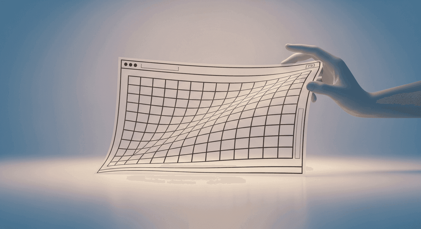
Have you ever landed on a website, started reading, and suddenly the text jumps around, an image loads late, or a button you were about to click moves out of reach? This frustrating experience is often due to 'layout shifts' and 'reflows' – common culprits behind a janky user experience and poor performance. For anyone building websites, understanding and mitigating these issues isn't just about polish; it's about delivering a stable, professional, and accessible product.
Layout shifts and reflows are fundamental browser behaviors impacting how smoothly your pages render. Mastering how to identify and debug them is a crucial skill for designers, front-end developers, and even no-code makers aiming for responsive and reliable creations.
What Are Layout Shifts and Reflows?
A **layout shift** occurs when a visible element on your page changes its position or size after rendering, causing other elements to move. This visual instability impacts user experience and is measured by the Cumulative Layout Shift (CLS) metric, a key part of Google's Core Web Vitals.
A **reflow** (or layout recalculation) is the browser's process of calculating the position and geometry of all elements. This happens when the DOM or CSS changes affecting layout. While normal, *unnecessary* or *frequent* reflows lead to performance bottlenecks and contribute to noticeable layout shifts. A layout shift is the *visible effect* of content moving, often *caused* by an ungraceful reflow.
Common Causes of Layout Shifts
Many factors trigger unexpected layout shifts, often from asynchronous content loading or the browser not knowing element dimensions. A frequent offender is **images, videos, or iframes loaded without explicit `width` and `height` attributes**. The browser allocates no space initially, then media loads, pushing content down.
**Dynamically injected content** (ads, banners, forms) is another major cause. If the browser hasn't reserved space, its sudden appearance pushes existing content around. Similarly, **web fonts loading late** can cause a flash of unstyled text (FOUT) or invisible text (FOIT), where the page renders with a fallback font, then reflows when the custom font loads and takes different space.
Tools for Diagnosis
Modern browser developer tools offer powerful features to pinpoint layout shift sources. **Chrome DevTools** is paramount. The 'Performance' tab lets you record a session, visualizing rendering events and specific layout shifts, showing when and where they occur and which elements are involved.
The 'Rendering' tab offers a 'Layout Shift Regions' overlay, visually highlighting shifting areas in real-time. This feedback is invaluable. For a broader performance overview, **Lighthouse reports** (in DevTools or PageSpeed Insights) provide a Cumulative Layout Shift (CLS) score and suggest specific problematic elements.
- **Chrome DevTools Performance tab**: Record to view a timeline of rendering events and layout shifts.
- **Chrome DevTools Rendering tab**: Enable "Layout Shift Regions" to visually highlight shifts.
- **Lighthouse reports**: Get a comprehensive performance score, including CLS and recommendations.
- **PageSpeed Insights**: Provides CLS data and detailed suggestions.
- **Browser developer consoles**: Check for warnings or errors related to layout or resource loading.
Strategies for Prevention and Fixes
Preventing layout shifts relies on reserving space for elements. For **images, videos, and media**, always specify `width` and `height` attributes in HTML. CSS `aspect-ratio` is a powerful alternative, defining predictable space.
For **web fonts**, use `font-display: swap` or `font-display: optional` in `@font-face` to handle loading gracefully. Preload critical fonts using `<link rel="preload" as="font" crossorigin>`. For **dynamically injected content** like ads, reserve space with CSS (e.g., `min-height`) even if empty, preventing content pushes. Skeleton loaders aid smooth transitions.
Finally, for **animations**, `transform` and `opacity` are ideal as they don't trigger reflows. Avoid animating properties affecting geometry or position (e.g., `width`, `height`, `margin`, `top`), which cause reflows and shifts.
Best Practices for Stable Layouts
Beyond specific fixes, general best practices ensure stable, performant layouts. Prioritize loading **critical CSS** first for above-the-fold content, ensuring a stable initial render. Avoid injecting new content above existing content; append it or load within pre-allocated spaces.
Preloading important assets (fonts, images, JavaScript) speeds availability, reducing late content pop-ins. Always **test across various devices and network conditions**; a fast-connection layout might shift on slow mobile.
Understand which **CSS properties trigger reflows**. Properties affecting an element's box model (`width`, `height`, `margin`, `padding`, `border`), position (`top`, `left`, `position`), or content layout (`font-size`, `display`, `flex`, `grid`) cause recalculations. Awareness helps anticipate and mitigate impact, leading to a much smoother user experience.
Sources & Further Reading
- Optimize Cumulative Layout Shift — web.dev
- Website Response Times — Nielsen Norman Group
- How browsers work — MDN Web Docs
- Core Web Vitals — Google Search Central