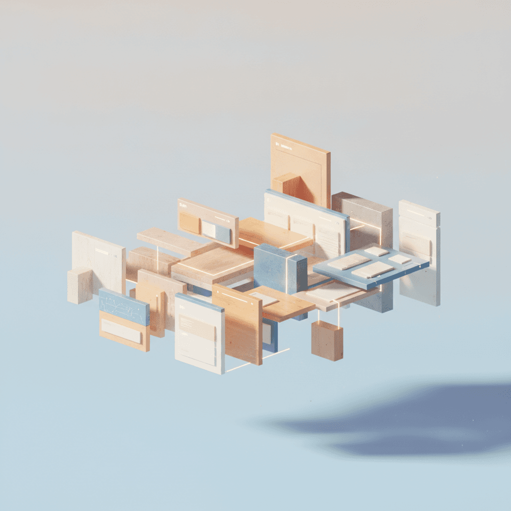
No-code page builders have revolutionized website creation, democratizing development for designers, makers, and developers alike. These platforms enable rapid prototyping and deployment without writing code. However, their true power and scalability often reside in their approach to reusable component systems.
Understanding how different no-code builders handle components – from individual elements to entire sections – is critical for building robust, consistent, and maintainable websites. This article compares reusable component systems, helping you align with your project's needs and long-term vision.
The Power of Reusability in No-Code
Component-based architectures are the gold standard for scalable applications. No-code page builders bring this paradigm to a wider audience, enabling modular design. Reusable components are pre-designed, self-contained UI blocks deployed multiple times, ensuring visual and functional consistency across a website.
This approach speeds up development significantly; use pre-built components instead of recreating elements like navigation bars. It enforces design consistency, as updates to a master component propagate automatically, reducing design drift. Furthermore, it simplifies maintenance and collaboration, centralizing changes.
Understanding Component Systems: A Spectrum of Control
Not all "reusable components" in no-code are equal. Page builders offer a spectrum of reusability, from basic global styles to sophisticated component libraries. This dictates your control over instances versus global changes, and how easily components adapt to contexts.
- Global Styles: Site-wide settings for typography, colors, spacing, and button styles.
- Reusable Sections/Blocks: Entire page sections (e.g., footers, hero banners) saved as templates, often linked for global updates.
- Custom Components/Symbols: Individual or small groups of elements (e.g., custom cards) designed once and reused, typically linked to a master.
- Dynamic Data Integration: Components designed to pull and display content from external sources or CMS collections.
- Component Libraries: Centralized repositories for organizing, searching, and deploying saved components.
How Page Builders Implement Reusable Components
Implementation varies. Some builders use a "linked instance" model: placed components remain connected to their original master, with master changes automatically updating all linked instances. This is powerful for consistency but requires planning.
Others offer "copy and paste," creating independent copies. While flexible for local modifications, it sacrifices linked reusability's efficiency. Advanced systems often blend these, allowing you to "detach" an instance for local overrides while maintaining core links.
Overriding specific properties (like text/images) within a linked instance, while keeping structural/stylistic properties global, is key. This allows personalization without sacrificing component integrity, balancing global consistency and local adaptability.
Key Considerations When Choosing a Builder
A builder's component system is primary for scalable projects. Evaluate the ease of creating and saving components. Is it intuitive? Look for clear visual indicators differentiating global and local edits to understand change impact.
Assess override flexibility. Can you easily change content or styles on an instance without detaching? Does it support dynamic content from a CMS? A robust component library with search, categorization, and previews is invaluable for larger projects.
Consider collaboration. How do team members interact with the library? Are there version control or approval workflows for changes? A well-designed system facilitates seamless teamwork with approved design assets.
Best Practices for Component-Driven No-Code Development
A component-driven workflow requires a strategic mindset. Plan components early by identifying recurring UI patterns for reusable blocks. This proactive approach saves time and prevents inconsistencies.
Use clear, consistent naming conventions. A well-organized library with descriptive names makes components easy to find and use, especially as projects grow. Regularly review for redundancies or refactoring opportunities to keep the system lean.
Documenting components – their purpose and usage – is beneficial. While explicit features may lack, internal notes or an external guide maintain clarity. Always test reusable components across different pages and contexts for expected behavior and responsiveness.
The true power of no-code page builders lies in their robust reusable component systems. Understanding different builder approaches – from global styles to dynamic, linked components – enables informed decisions impacting project longevity and maintenance.
For designers, makers, and developers, embracing component-driven no-code is about building higher-quality, consistent, and adaptable websites. Carefully evaluating a platform's component capabilities ensures you build a sustainable digital product.
Sources & Further Reading
- No-code development platform — Wikipedia
- Design system — Wikipedia
- Web Components — MDN Web Docs
- Design Systems 101 — Nielsen Norman Group
- How to Create a Design System: A Step-by-Step Guide — Interaction Design Foundation