In the fast-paced world of web design, clarity and usability are paramount. Users arrive at your site with a goal, and it's your job to guide them effortlessly to their destination. This guidance isn't just about clear navigation menus or well-written calls to action; it's fundamentally about how you arrange and present information visually. An intuitive visual hierarchy ensures users instantly grasp what's important, what's related, and how to interact with your content.
At the heart of creating such effective visual structures lie Gestalt principles. These psychological concepts explain how humans instinctively perceive and organize visual information into coherent wholes rather than just individual parts. By understanding and applying these principles, you can design interfaces that feel natural, reduce cognitive load, and significantly enhance the user experience on any website.
Understanding Visual Hierarchy: Why It Matters
Visual hierarchy is the arrangement of elements on a page in a way that implies importance, order, and relationships. Think of it as a roadmap for the user's eye, dictating where they should look first, second, and so on. Without a clear hierarchy, a webpage can feel chaotic, forcing users to work harder to find what they need, leading to frustration and potential abandonment.
A well-defined visual hierarchy reduces cognitive load by presenting information in digestible chunks, allowing users to quickly scan and understand the content's structure. It improves usability, facilitates faster information processing, and ultimately leads to a more satisfying and efficient interaction with your website. Mastering this skill is a cornerstone for any designer or developer aiming to create truly user-friendly digital products.
Proximity: Grouping Related Elements
The principle of Proximity states that objects physically close to each other tend to be perceived as a group. This is one of the most fundamental and powerful Gestalt principles for web design. If elements are close, our brains naturally assume they are related; if they are far apart, they are seen as separate.
In practice, this means using whitespace strategically. Group related form fields together, place a button close to the action it triggers, or keep a headline near its corresponding paragraph. Conversely, adding more space between unrelated sections clearly delineates them. Effective use of proximity makes your layouts feel organized and helps users quickly understand the relationship between different pieces of content.
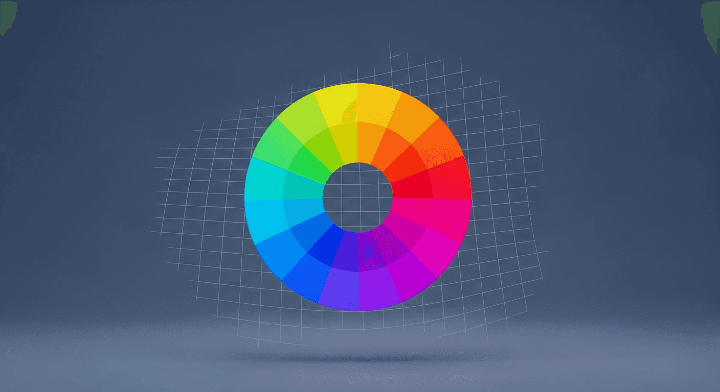
Similarity: Creating Visual Cohesion
The principle of Similarity suggests that elements sharing visual characteristics such as color, size, shape, or texture are perceived as belonging together. This is crucial for establishing patterns and consistency across your website, helping users recognize functional relationships at a glance.
For instance, if all your interactive buttons share a consistent color and shape, users quickly learn that anything with those attributes is clickable. Similarly, maintaining consistent font sizes and styles for headings or body text creates a predictable and easily scannable content structure. Similarity reinforces patterns, reduces the learning curve, and makes your interface feel cohesive and professional.
- Consistent typography for headers and body text across all pages.
- Uniform button styles, including color, shape, and hover effects.
- Using a consistent color palette for all interactive elements like links and icons.
- Employing similar iconography for related actions or categories.
- Maintaining a consistent card design for blog posts, products, or team members.
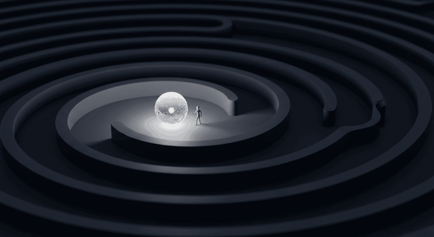
Continuity and Closure: Guiding the Eye Through Flow
The principle of Continuity posits that our eyes tend to follow the smoothest path when viewing lines, curves, or a series of elements, even if there are breaks. This means elements arranged in a line or a gentle curve are perceived as belonging together and create a natural flow. In web design, this can be applied to navigation menus, content streams, or sequential steps in a process, guiding the user's gaze from one element to the next without interruption.
Closure is the tendency for our brains to perceive incomplete shapes or forms as complete. We fill in the missing parts to create a whole. This principle allows designers to use minimalist icons or partially visible images, trusting the user's brain to complete the picture. It can save space and add a touch of elegance, but it requires careful consideration to ensure the implied shape is still clear and unambiguous.
Figure/Ground: Distinguishing Content from Context
The Figure/Ground principle describes our innate ability to separate an object (the figure) from its surrounding background (the ground). In web design, this is fundamental for ensuring that your primary content stands out and is easily distinguishable from its environment. Think of text on a page: the text is the figure, and the page background is the ground. The contrast between them is crucial.
Applying this involves using sufficient contrast in color, brightness, and texture to ensure key elements like headings, buttons, or main content blocks pop. Modal windows, for example, often use a darker, semi-transparent overlay to push the background content into the 'ground,' bringing the modal (the 'figure') to the forefront. Clear figure/ground relationships prevent visual clutter and help users focus on what matters most.
Focal Point & Common Fate: Drawing Attention and Movement
A Focal Point is an element that stands out significantly from its surroundings, immediately drawing the user's attention. This can be achieved through stark contrast in size, color, shape, or by isolating an element. Use focal points sparingly and intentionally for your most critical calls to action or key pieces of information, ensuring they truly command attention.
Common Fate refers to the perception that elements moving in the same direction, or exhibiting similar animated behaviors, are perceived as a group. This is particularly relevant in modern web design with interactive elements. Think of items sliding into view together, or a series of accordion panels expanding and collapsing in unison. This principle helps organize dynamic content and reinforces functional relationships through shared motion.
By consciously applying Gestalt principles like Proximity, Similarity, Continuity, Closure, Figure/Ground, Focal Point, and Common Fate, you move beyond merely arranging elements on a screen. You begin to design experiences that align with how the human brain naturally perceives and processes information. This thoughtful approach to visual hierarchy not only makes your websites more aesthetically pleasing but, more importantly, makes them intuitive, efficient, and a pleasure to use for everyone.
Sources & Further Reading
- The Principle of Proximity — Interaction Design Foundation
- The Principle of Similarity — Interaction Design Foundation
- Gestalt psychology — Wikipedia