Colors are more than just aesthetics; they influence user perception, evoke emotions, and guide user behavior. A well-chosen color palette is fundamental to effective web design, contributing to readability, accessibility, and brand identity. It's a critical element that can make or break a user's experience on your site.
For designers, developers, and freelancers, understanding how to strategically select and apply colors is an invaluable skill. This guide will walk you through the essential steps, from grasping basic color theory to practical application and testing, ensuring your website's visual language is both appealing and effective.
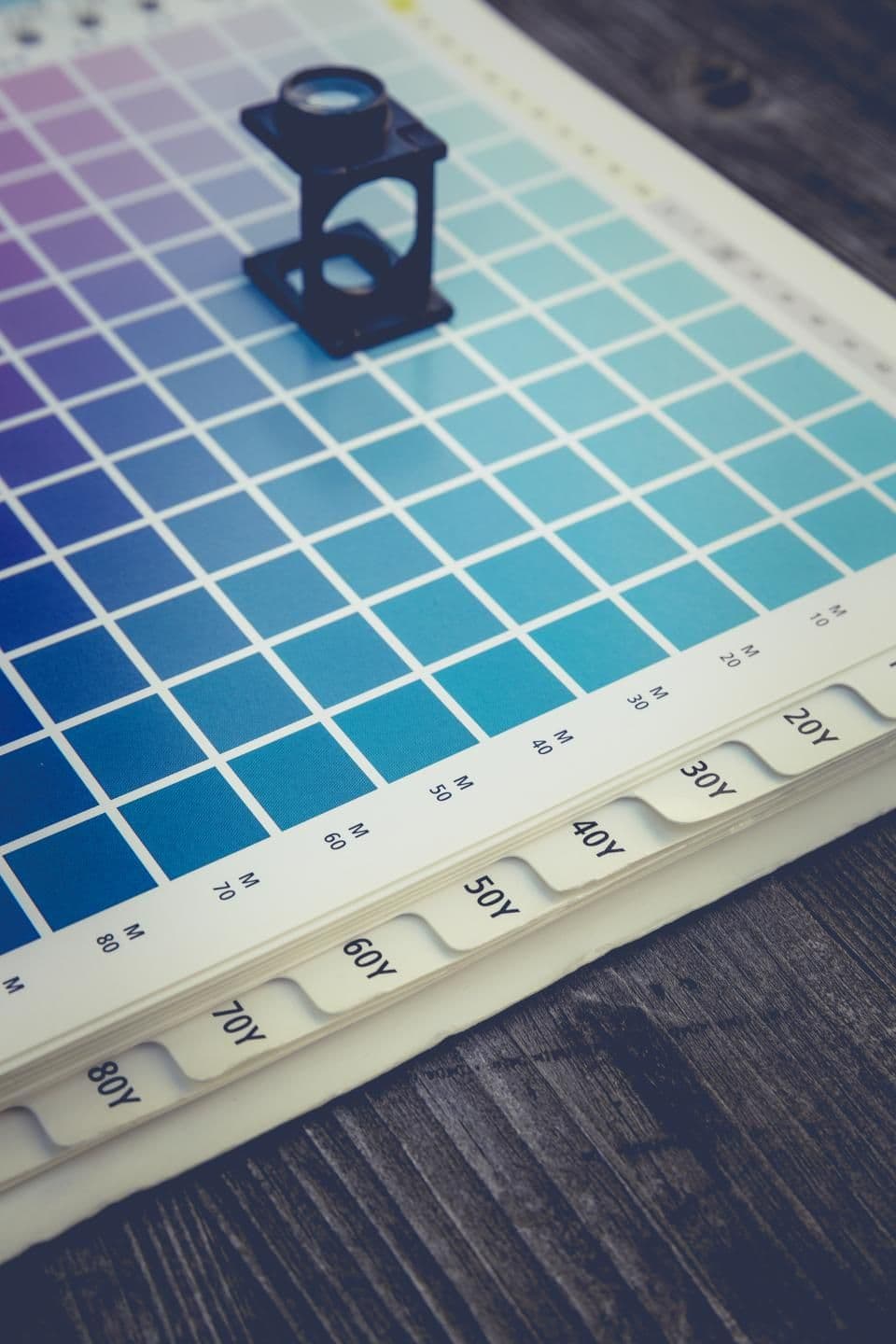
Understanding the Fundamentals of Color Theory
Before diving into specific color choices, a basic understanding of color theory is crucial. The color wheel is your primary tool, illustrating relationships between colors. Key concepts include hue (the pure color), saturation (intensity), and brightness (lightness/darkness). Knowing these helps you create harmonious combinations.
Common color schemes derived from the color wheel include monochromatic (variations of one color), analogous (colors next to each other), complementary (colors opposite each other for high contrast), triadic (three evenly spaced colors), and tetradic (two pairs of complementary colors). Each scheme evokes a different mood and offers distinct visual characteristics.
Consider the psychological impact of colors. Blue often conveys trust and professionalism, green suggests nature and growth, red signifies passion or urgency, and yellow implies optimism. These associations can vary culturally, so keep your target audience in mind.
Researching Your Brand, Audience, and Competition
Your website's color palette should be a direct extension of your brand identity. What are your brand's core values, mission, and personality? Is it playful, serious, modern, or traditional? These characteristics should inform your color choices. If an existing brand guide is in place, adhere to it strictly.
Who is your target audience? Their demographics, psychographics, and cultural background play a significant role in how they perceive colors. A website targeting children will use a vastly different palette than one for financial advisors. Research their preferences and what resonates with them emotionally.
Analyze your competitors. What colors do they use? While you don't want to copy them, understanding industry norms can help you either fit in or strategically stand out. Identify gaps or opportunities to differentiate your brand through color.
Building Your Palette: Primary, Secondary, and Accent Colors
A balanced color palette typically consists of a primary color, one or two secondary colors, and an accent color. The primary color is dominant, used for major elements like headers, main calls-to-action, or large background sections, often reflecting the brand's core identity.
Secondary colors support the primary, used for subheadings, less critical buttons, or supporting graphics. They should complement the primary color without competing. Often, these are variations of the primary or analogous colors.
Accent colors are used sparingly to draw attention to crucial elements, such as key calls-to-action, important links, or interactive states. They should provide high contrast with the primary and secondary colors to ensure visibility and urgency. Think of the 60-30-10 rule: 60% dominant color, 30% secondary, 10% accent.
Leveraging Tools and Resources for Palette Generation
Fortunately, you don't have to generate color palettes from scratch. Numerous online tools and resources can assist in creating harmonious and accessible combinations. These tools often allow you to start with a base color and explore various schemes.
- Color Palette Generators: Websites like Coolors.co, Adobe Color, and Paletton allow you to quickly generate, explore, and save color schemes based on different color theory rules.
- Design System Libraries: Explore existing design systems (e.g., Material Design, Ant Design) for inspiration on how colors are structured and applied across components.
- Inspiration Galleries: Sites like Dribbble, Behance, and Awwwards showcase real-world examples of stunning website designs and their accompanying color palettes.
- Accessibility Checkers: Tools like WebAIM Contrast Checker are essential for ensuring your chosen colors meet WCAG guidelines for contrast, making your website usable for everyone.
- Browser Developer Tools: Use the color picker and contrast checker built into your browser's developer tools to test colors directly on your site during development.
Remember to consider accessibility from the outset. High contrast ratios are vital for readability, especially for text against backgrounds. Many tools offer built-in accessibility checks, which are invaluable for ensuring your design is inclusive.
Testing, Iteration, and Consistency
Once you have a potential palette, it's crucial to test it in a real-world context. Apply your chosen colors to mockups or wireframes of your website. See how they look on different screen sizes and devices. Pay attention to how the colors interact and whether the hierarchy is clear.
Gather feedback from peers or target users. Do the colors evoke the desired emotions? Is the text readable? Are calls-to-action prominent? Be open to iterating and refining your palette based on this feedback. Sometimes, a slight adjustment in saturation or brightness can make a significant difference.
Consistency is paramount. Once your palette is finalized, ensure it's applied uniformly across all pages and elements of your website. Document your color codes (HEX, RGB, HSL) in a style guide or design system to maintain visual coherence, especially when working in a team or on larger projects.
Sources & Further Reading
- Color theory — Wikipedia
- Color model — Wikipedia
- color — MDN Web Docs
- Color Theory For Designers, Part 1: The Meaning Of Color — Smashing Magazine
- A Color Accessibility Workflow — A List Apart