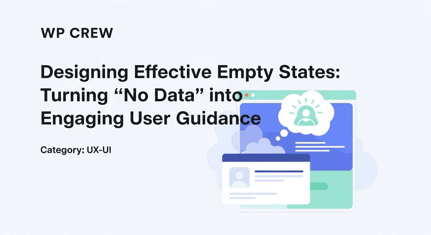
Every digital product, no matter how feature-rich or brilliantly conceived, will at some point present a user with a blank screen. Perhaps they've just signed up and haven't added any content, cleared their notifications, or performed a search with no results. These are "empty states" – moments where a particular area of your interface has no data to display. Too often, these critical touchpoints are overlooked, resulting in generic, unhelpful messages that leave users confused, frustrated, or simply disengaged. This is a missed opportunity to foster connection and guide users effectively.
Instead of being dead ends, empty states can be powerful opportunities to educate, encourage, and even delight your users. They are prime real estate for onboarding, re-engaging, and helping users understand how to interact with your product. For designers, makers, and developers, mastering the art of the empty state isn't just about good UX; it's about transforming potential friction points into moments of genuine value, turning "no data" into compelling user guidance that drives adoption and satisfaction.
What Are Empty States and Why Do They Matter?
An empty state, sometimes called a zero state, is the screen or section of an application or website that a user sees when there is no content to display. This could be because it's a new account, a search yielded no results, a list has been cleared, or an error prevented data from loading. Common scenarios include an empty inbox, an empty shopping cart, a tasks list with no tasks, or a photo gallery with no uploaded images.
These moments are often an afterthought in the design process, leading to generic "No items found" messages. However, for a user, an empty state can be a moment of confusion. Without context or direction, they might wonder if they've used the product incorrectly, if it's broken, or if the feature simply isn't useful to them. A poorly designed empty state can increase cognitive load, erode trust, and even lead to user abandonment, especially during critical onboarding phases.
Conversely, a well-designed empty state serves as a mini-onboarding experience, a helpful guide, or a delightful interaction. It reinforces your brand's personality, provides a clear path forward, and reassures the user. Recognizing the strategic importance of these states transforms them from simple placeholders into integral components of a thoughtful user journey, significantly impacting user perception and retention.
The Core Principles of Effective Empty State Design
Moving beyond mere placeholders, effective empty states are built on a foundation of user-centric principles. They don't just acknowledge a lack of data; they actively address the user's potential confusion and guide them towards a solution. The goal is to turn a potential dead end into a clear path forward, making the user feel supported and capable.
At their heart, successful empty states inform, guide, and ideally, delight. They must be contextual, understanding where the user is in their journey and what action they are most likely to want or need to take next. By considering the 'why' behind the empty state, designers can craft experiences that genuinely help rather than hinder.
Informative and Instructional
The primary role of an empty state is to explain *why* the screen is empty and *what* the user needs to do to fill it. This involves clear, concise copy that provides context and instruction. Avoid jargon or overly technical explanations; speak directly and simply, empowering the user to take the next step without feeling overwhelmed.
Engaging and On-Brand
An empty state is an extension of your brand. Use it to reinforce your product's personality, tone of voice, and visual identity. A touch of humor, a relevant illustration, or a clever animation can transform a mundane message into a memorable and positive interaction, fostering a stronger connection with the user.
Actionable and Goal-Oriented
Crucially, an empty state must provide a clear call to action (CTA). What's the very next step the user should take? Whether it's to create an item, import data, adjust search filters, or learn more, the CTA should be prominent and lead directly to the desired outcome. This proactive guidance minimizes friction and encourages continued engagement.
Common Scenarios for Empty States and Tailored Approaches
Not all empty states are created equal. The strategy for designing an effective empty state must be tailored to the specific context in which it appears. Understanding the user's likely intent and emotional state when encountering a blank screen is key to providing relevant and helpful guidance.
First-Time User Experiences (Zero State)
This is perhaps the most critical empty state. When a new user logs in for the first time, they're looking for guidance. An empty state here acts as an initial onboarding step, showcasing the product's value proposition and guiding them towards their first meaningful action. It's an opportunity to teach, encourage, and make a great first impression.
- Welcome message with a friendly tone.
- Clear explanation of the feature's purpose and benefits.
- Prominent primary call to action (e.g., "Create Your First Project," "Upload Your First Photo").
- Optional secondary actions (e.g., "Watch a Tutorial," "Learn More About This Feature").
- Visual cues (illustrations, animations) that hint at the filled state.
User-Generated Content (Zero State)
For features like task lists, dashboards, or content feeds that rely on user input, the empty state should motivate creation. It's about setting the stage for what the user can achieve once they start contributing. The focus is on making the initial action feel easy and rewarding, reducing the barrier to entry.
Search & Filter Results (No Results Found)
When a search or filter yields no results, users can feel frustrated or question their input. The empty state here should reassure them, explain *why* there are no results, and most importantly, help them refine their query. Suggestions for alternative searches, broader categories, or even a 'reset filters' option are invaluable.
Errors & Technical Issues
An empty state due to an error (e.g., connection lost, data failed to load) requires a different tone. Empathy and clear communication are paramount. Explain what happened in plain language, avoid blaming the user, and provide clear steps they can take to resolve the issue or report it. A simple 'Try Again' button can often be enough.
Data Depletion or Deletion
Sometimes, an empty state appears because a user has cleared or deleted all their content. In these cases, the empty state should acknowledge their action and provide options for refilling the space. For example, after clearing an inbox, the empty state could suggest creating a new message or revisiting archived emails.
Essential Elements of a Great Empty State
While context dictates the specific content, most effective empty states share a common set of elements that work together to inform, guide, and engage. Thinking of these elements as a toolkit can help ensure you cover all necessary bases for a comprehensive and helpful experience.
- **Clear Headline:** A concise, attention-grabbing title that explains the situation (e.g., "No Messages Yet," "Your Cart is Empty").
- **Helpful Body Copy:** A brief, informative sentence or two that provides context, explains *why* the state is empty, and hints at the benefit of filling it.
- **Relevant Visual:** An icon, illustration, or subtle animation that reinforces the message, adds personality, and makes the state less intimidating. It should not be purely decorative but functional.
- **Strong Call to Action (CTA):** A prominent button or link that clearly indicates the primary action the user should take (e.g., "Add Your First Task," "Shop Now"). This should be the most visually dominant interactive element.
- **Optional Secondary Actions:** Sometimes, offering an alternative or exploratory path can be beneficial (e.g., "Learn More," "Import Data"). These should be less prominent than the primary CTA.
- **On-Brand Tone:** Ensure the language and visuals align with your product's overall voice and aesthetic, reinforcing brand consistency.
Crafting Compelling Copy for Empty States
The text within an empty state is paramount. It's the primary means of communication, providing direction, reassurance, and motivation. Bad copy can exacerbate frustration, while good copy can turn a potential negative into a positive, guiding the user seamlessly to their next action.
When writing empty state copy, aim for clarity, conciseness, and a human touch. Be direct about the situation but also encouraging about the solution. Avoid technical jargon or overly formal language. For instance, instead of "Query yielded no results," try "No matches found for your search. Try a different keyword?" or "We couldn't find anything matching 'X.' Perhaps try a broader search or check your spelling?" The latter feels more helpful and less accusatory.
Consider the user's emotional state. If it's a first-time experience, be welcoming and instructional. If it's a 'no results' scenario, be empathetic and offer clear pathways for refinement. If it's an error, be reassuring and provide actionable recovery steps. The copy should always feel supportive and empower the user to move forward confidently.
Visual Design: Beyond Placeholder Graphics
Visuals play a crucial role in making empty states engaging and intuitive. They can reinforce your message, reduce cognitive load, and add a touch of delight that enhances the overall user experience. This goes far beyond simply slapping on a generic "no data" icon.
Thoughtful illustrations, custom icons, or even subtle animations can transform a bland empty state into an inviting one. These visuals should be relevant to the context, hinting at the potential content or action. For example, an empty shopping cart might feature a small, whimsical illustration of an empty basket, encouraging the user to fill it. An empty photo gallery might show a camera icon with an upward-pointing arrow, clearly indicating the action to take.
Consistency is also key. Ensure the visual style of your empty state aligns with your product's broader design language. This maintains a cohesive brand experience and prevents empty states from feeling like disconnected, afterthought elements. A well-chosen visual can communicate more effectively than words alone, making the empty state both functional and aesthetically pleasing.
Implementing and Testing Empty States
Designing effective empty states shouldn't be a last-minute addition; it needs to be integrated into your design and development workflow from the outset. As you map out user flows and create wireframes or prototypes, identify all potential empty states and consider their design requirements alongside the 'filled' states. This proactive approach ensures a consistent and thoughtful user experience across all scenarios.
Prototyping and user testing are invaluable here. Don't just show users the filled states; actively solicit feedback on empty states. Do users understand why the screen is empty? Is the guidance clear? Do they know what to do next? Observing users interacting with these states can reveal unexpected confusion or opportunities for improvement. Iterate based on this feedback, refining your copy, visuals, and calls to action until the empty state truly serves its purpose.
Developers should also be aware of these designs early on. Implementing empty states correctly requires careful consideration of backend data states and frontend rendering logic. Clear communication between design and development teams ensures that these crucial moments are handled gracefully and effectively in the live product, providing a robust and user-friendly experience even in the absence of data.
Key Takeaways for Designing Impactful Empty States
- Empty states are critical UX opportunities, not just placeholders. Use them to educate, engage, and guide.
- Prioritize clear, concise, and empathetic copy that explains the situation and offers a solution.
- Provide a prominent, actionable Call to Action (CTA) that leads the user to their next logical step.
- Use relevant visuals (illustrations, icons) to add context, reinforce brand, and make the experience more delightful.
- Tailor your empty state design to the specific context and user's emotional state (first-time, no results, error, etc.).
- Integrate empty state design into your core workflow and test them thoroughly with real users to ensure effectiveness.
Sources & Further Reading
- Empty States: The Overlooked Opportunity — Interaction Design Foundation
- User experience design — Wikipedia
- Error Message Guidelines — Nielsen Norman Group