In the fast-paced digital landscape, a landing page is often your first and best chance to make an impression and guide a visitor towards a specific goal. It's more than just a web page; it's a dedicated conversion tool, meticulously crafted to turn casual browsers into engaged leads, loyal customers, or subscribers. However, simply having a landing page isn't enough. Its layout and design must be strategically engineered to eliminate distractions, build trust, and compel action.
This article will demystify the art and science behind designing high-converting landing page layouts. We'll explore the fundamental principles that drive user behavior, dissect the essential elements, and provide actionable examples to help designers, makers, and developers like you create pages that don't just look good, but perform exceptionally. Get ready to transform your landing pages into powerful conversion engines.
Understanding the Core Purpose of Your Landing Page
Before you even think about pixels and typography, you must define the singular purpose of your landing page. Unlike a typical website page that might offer navigation to various sections, a landing page has one, and only one, primary objective. This clarity is the bedrock of its design and directly influences every element you place on it.
Is its goal to capture email leads for a newsletter? Drive sign-ups for a webinar? Sell a specific product? Encourage a software download? Every decision, from your headline to your call-to-action (CTA), must funnel the user towards this one specific conversion goal. Any element that doesn't support this goal is a distraction and should be removed, creating an uncluttered path to conversion.
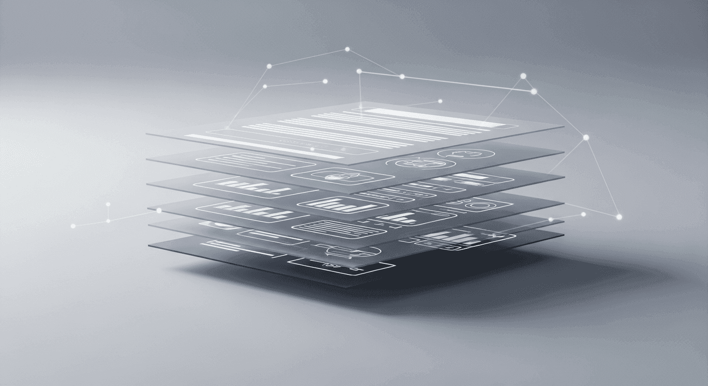
The Anatomy of a High-Converting Layout: Essential Elements
While every landing page is unique, successful ones share a common set of foundational elements. Understanding how these components interact and support each other is crucial for building an effective layout. Think of them as the building blocks that guide your visitor from curiosity to conversion.
These elements work in concert, creating a narrative flow that addresses user needs, builds confidence, and ultimately drives action. A well-designed layout arranges these components in a logical, visually appealing, and intuitive sequence, making it easy for visitors to grasp your offer and convert.
- Compelling Headline: Grabs attention and communicates the core value.
- Clear Value Proposition: Explains what you offer and why it matters.
- Engaging Hero Image/Video: Visually reinforces the message and evokes emotion.
- Benefit-Oriented Body Copy: Details features as benefits, addressing pain points.
- Trust Signals (Social Proof): Builds credibility through testimonials, logos, or reviews.
- Single, Prominent Call-to-Action (CTA): Guides the user to the next step.
Crafting an Irresistible Above-the-Fold Experience
The 'above the fold' area is the portion of your landing page visible without scrolling. This prime real estate is your first impression and arguably the most critical section. It needs to instantly communicate your offer, its value, and the desired action. Users decide within seconds whether to stay or leave, making this area a make-or-break zone for conversions.
Your headline, sub-headline, primary call-to-action, and a compelling hero image or video should all reside above the fold. These elements must work together to answer the visitor's implicit questions: 'What is this?', 'What's in it for me?', and 'What should I do next?' Ensure visual clarity and a strong sense of purpose to hook your audience immediately.
Visual Hierarchy: Guiding the User's Eye to Conversion
Visual hierarchy is the arrangement of elements in order of importance, dictating the path your visitor's eye takes across the page. Effective visual hierarchy uses size, color, contrast, spacing, and position to emphasize crucial information and subtly lead the user towards the call-to-action. Without it, a page can feel chaotic and overwhelming, causing visitors to abandon it.
Think about how you want users to scan your page. Larger, bolder text typically draws the eye first (e.g., your headline). High-contrast colors can make a CTA button pop. Strategic use of white space can isolate and highlight key elements. Common eye-tracking patterns like the 'F-pattern' (reading across the top, down the left, and occasionally across again) and 'Z-pattern' (across the top, diagonally down, then across the bottom) can inform your layout decisions, ensuring your most vital content aligns with natural scanning habits.
The Power of Persuasion: Trust, Social Proof, and Urgency
Beyond a great offer, people need to trust you before they commit. Integrating elements that build credibility and alleviate skepticism is paramount for conversion. These persuasive tools act as psychological nudges, making visitors feel more comfortable taking the desired action.
Building Trust with Authority and Credibility
Displaying logos of recognizable clients, media mentions, industry awards, or security badges (like SSL certificates) can significantly boost trust. Transparent privacy policies and clear contact information also signal legitimacy and professionalism.
Leveraging Social Proof Effectively
People are influenced by the actions and opinions of others. Testimonials, user reviews, case studies, and even simple numerical indicators like 'Used by 10,000+ customers' or '5-star rating' provide powerful social proof. Ensure testimonials are authentic and ideally include a photo and name to enhance credibility. Video testimonials are even more impactful.
Introducing Urgency and Scarcity (Use with Care)
Creating a sense of urgency ('Limited-time offer,' 'Ends soon') or scarcity ('Only X spots left,' 'While supplies last') can motivate immediate action by playing on the fear of missing out. However, use these tactics ethically and sparingly. Fabricated urgency can damage trust and brand reputation.
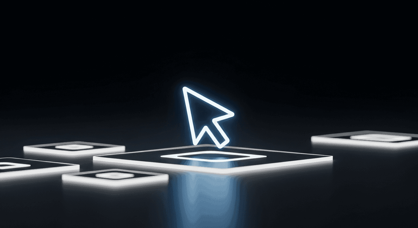
Designing an Unmissable Call-to-Action (CTA)
Your Call-to-Action is the culmination of all your design efforts. It's the moment of truth, and it must be clear, compelling, and utterly unmissable. A weak or confusing CTA can undo all the good work of a meticulously designed page.
The CTA button should stand out visually through contrasting colors, ample white space, and a size that commands attention without being intrusive. Its text should be action-oriented and clearly state what the user will get or do ('Download My Free Ebook,' 'Start Your 14-Day Trial,' 'Get Instant Access'). Avoid generic phrases like 'Click Here.' Place your primary CTA above the fold and consider repeating it further down the page if your content requires scrolling.
- Be specific and action-oriented: "Get My Free Guide," not "Submit."
- Use contrasting colors: Make it pop against the background and other elements.
- Give it ample white space: Allow it to breathe and stand out.
- Place it strategically: Above the fold is crucial, repeat it if the page is long.
- Keep it concise: Short, punchy, and clear text.
- Test different button texts and designs: A/B testing can reveal optimal performance.
Optimizing Forms for Frictionless Conversions
If your landing page's goal is lead generation, the form is your conversion gateway. Every field you add creates friction, potentially deterring a visitor. The golden rule is: only ask for the information you absolutely need at that specific stage of the funnel.
Design forms with clear labels, intuitive input fields, and single-column layouts for easier completion. Implement inline validation to provide immediate feedback on errors. Reassure users about privacy (e.g., 'We respect your privacy. No spam, ever.') near the form. For complex forms, consider multi-step processes to reduce perceived effort, breaking it into smaller, manageable chunks.
Mobile-First Design: A Non-Negotiable for Modern Landing Pages
With a significant portion of web traffic originating from mobile devices, a mobile-first approach is no longer optional; it's fundamental. Designing for smaller screens first ensures your landing page is accessible, usable, and high-converting for the vast majority of your audience. Google's mobile-first indexing also makes this a critical factor for SEO.
Ensure your layout is fully responsive, adapting seamlessly to different screen sizes. Pay attention to touch target sizes (buttons and links should be easily tappable), legible font sizes, and fast load times. Minimize large images and unnecessary animations that can slow down mobile performance. Prioritize content and CTA placement for easy navigation and conversion on the go.
The Iterative Process: Test, Analyze, and Refine
Designing a high-converting landing page isn't a one-and-done task; it's an ongoing process of optimization. Even the most expertly designed page can be improved. A/B testing is your most powerful tool here, allowing you to compare two versions of a page (A and B) to see which performs better.
Test everything: headlines, hero images, CTA button colors and text, form field order, and even the placement of social proof. Utilize tools like Google Optimize, Optimizely, or built-in CRM landing page testers. Track key metrics such as conversion rate, bounce rate, time on page, and scroll depth. Heatmaps and user recordings can provide invaluable qualitative insights into how users interact with your page. Continuous analysis and refinement based on data are what truly unlock peak conversion performance.
Key Takeaways for High-Converting Landing Page Layouts
Designing a landing page that consistently converts is a blend of art, psychology, and data-driven strategy. By adhering to core principles and continuously refining your approach, you can create powerful assets that drive tangible results for your business or clients. Remember, every element on your page should have a purpose: to move the user closer to your singular conversion goal.
Focus on clarity, establish trust, guide the user's eye with strong visual hierarchy, and make the desired action unmistakably clear. Embrace a mobile-first philosophy and commit to an iterative process of testing and optimization. With these principles in hand, you'll be well-equipped to design landing page layouts that don't just look great, but truly excel at turning visitors into valuable conversions.
Sources & Further Reading
- Landing page — Wikipedia
- The 7 Fundamental Principles of User Experience Design — Interaction Design Foundation
- Media queries — MDN Web Docs
- The Laws of UX — Interaction Design Foundation
- 10 Usability Heuristics for User Interface Design — Nielsen Norman Group